Overview and Motivation
We live in a world that is increasingly defined by our internet connectivity. How many Facebook friends we have, the number of retweets we got…it’s all a measure of our presence. We want to explore this internet presence on a global scale and look at how GDP and other measures of national development impact the level of internet usage in a country. Each of us is a member of a global network. Many of us are connected to it with devices small enough to fit in our pocket or on our wrist. With our project, we will discover how the political and economic characteristics of a nation affect internet use. Or, perhaps even more interestingly, how internet usage impacts these statistics.
Global Network provides a dashboard for users all over the world to see, at a glance, how the world uses the internet, and how that use has progressed over time. Using the visual capabilities of D3, we will implement visualizations that create an aesthetically appealing, engaging environment for the user. We are using all facets of the Heer and Schniederman hierarchy to provide users with a complete depiction of global internet usage. Finally, we hope to make our project largely scalable, such that incoming data will be constantly added to the site. This gives our project more relevance in the long term, which we believe is exceedingly important for an analysis of technology of any kind. Simply put, Global Network visualizes the progression of the internet age in countries around the world.
Questions
We began with three overarching questions that we aimed to solve with our visualization. This provided us with a framework that allowed to design our visualizations in an intuitive, approachable way, inviting users to explore, learn, and ultimately answer these questions themselves. The following are the questions that we, the Global Network, seek to answer.
1. How do demographic factors of a nation (GDP, employment, education, etc.) relate to number of internet users in a nation?
Which development indicators, if any, are good variables to predict a country's internet usage? Are some metrics better than others? Are wealth based indicators like GDP more explanatory than infrastructure indicators like safe water access?
2. How has internet usage changed over time? What nations are accelerating more quickly than others?
How do some regions of the world change in their internet use over time? Do some countries constantly dominate? Are there specific areas in the world that remain low in their internet usage?
3. How do different countries use social media?
How do different countries and regions vary in their overall level of usage? Which platforms are most popular? Are their platforms that are universally popular, or are countries more particular with the type of applications they use?
Data
Over 40,000 data points.
We obtained our data from two primary sources: the United Nations and the World Bank. These provided us with a credible, bountiful source of data. Our data have five main metrics, over the course of a 25 year period.
GDP.
This data was obtained from the World Bank, and was originally in units of Local Currency. To normalize the comparison of GDP, we converted these values to US Dollars using current exchange rates. While this does not account for fluctuation of value of currencies over time, we believe it still accurately represents overall trends.
Percent of Population who Use the Internet.
This data from the World Bank gives a national percentage of the proportion of the population that uses the internet regularly.
Percent of Population with Access to Safe Water.
This data, from the United Nations, gives a percentage of the population with "unburdened access" to potable water.
Percent of Population enrolled in Tertiary Education.
This metric includes technical and vocational schools as well as universities and other institutions of higher education. It represents the portion of the population who has either completed or is currently enrolled in tertiary school.
Percent of Population who are Unemployed.
This data is obtained from the World Bank and represents the portion of the population without work.
In addition, we used population data for each country, storing them in CSV and JSON files.
scripts
We initially obtained our demographic data from the World Bank, and converted this CSV file into a nested JSON object of children, grandchildren, etc. in order to properly format the data for the treemap visualization. Unfortunately, this data configuration is much too unwieldy to be useful for our other visualizations. So we wrote several scripts in order to parse our data.
jsonParsey.py, countryParser.py, csvParser.py, and worldDataComplete.py allowed us to output CSV and JSON files that were formatted in a way that was much more manageable to efficiently create our other visualizations. To be clear, we weren’t scraping for data with the python scripts; we were simply reorganizing our data into a more useful arrangement.
Exploratory Data Analysis
Like most first glimpses at large data sets, our analysis began with console.log() statements. This allowed us to familiarize ourselves with the hierarchical structure of the data in order to properly implement the code for our visualizations. Working through our data analysis, it seemed fairly obvious to use a map visualization in some way. We believed that, if we could link this map to a more familiar visualization, like a line or bar chart, we would truly have something special. As the project progressed, our familiarization with the data came from a more organic exploration of the data’s structures as we implemented our visualizations.
Related Work
Our opening page and, indeed, the project itself, was inspired by the well-known Facebook network visualization. It’s simplicity informed our design choices, and its complexity inspired us to explore how the world as a whole was connected via the internet.
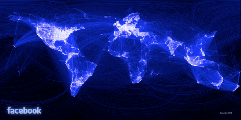
"Figure 1: Facebook Network Visualization"
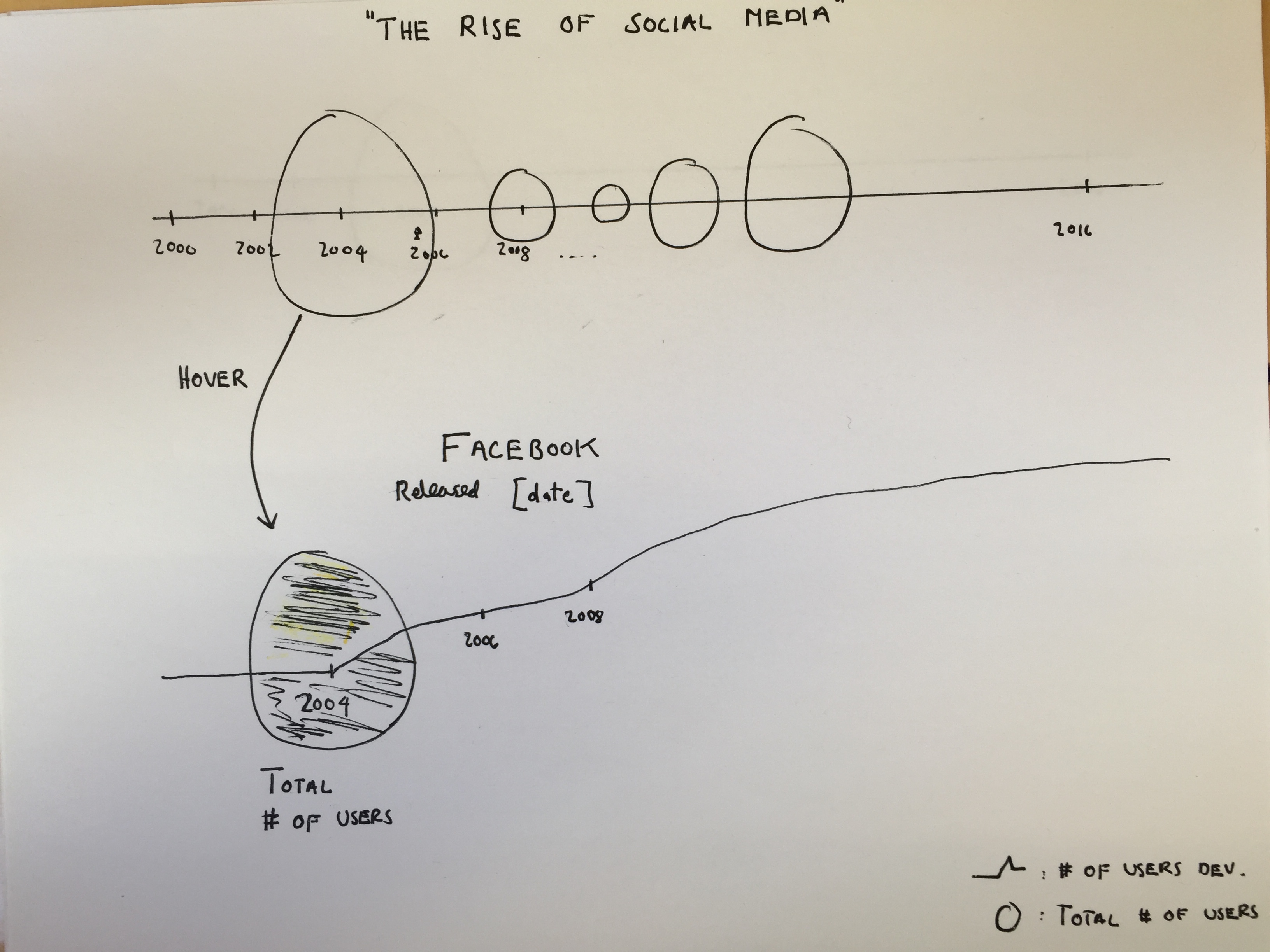
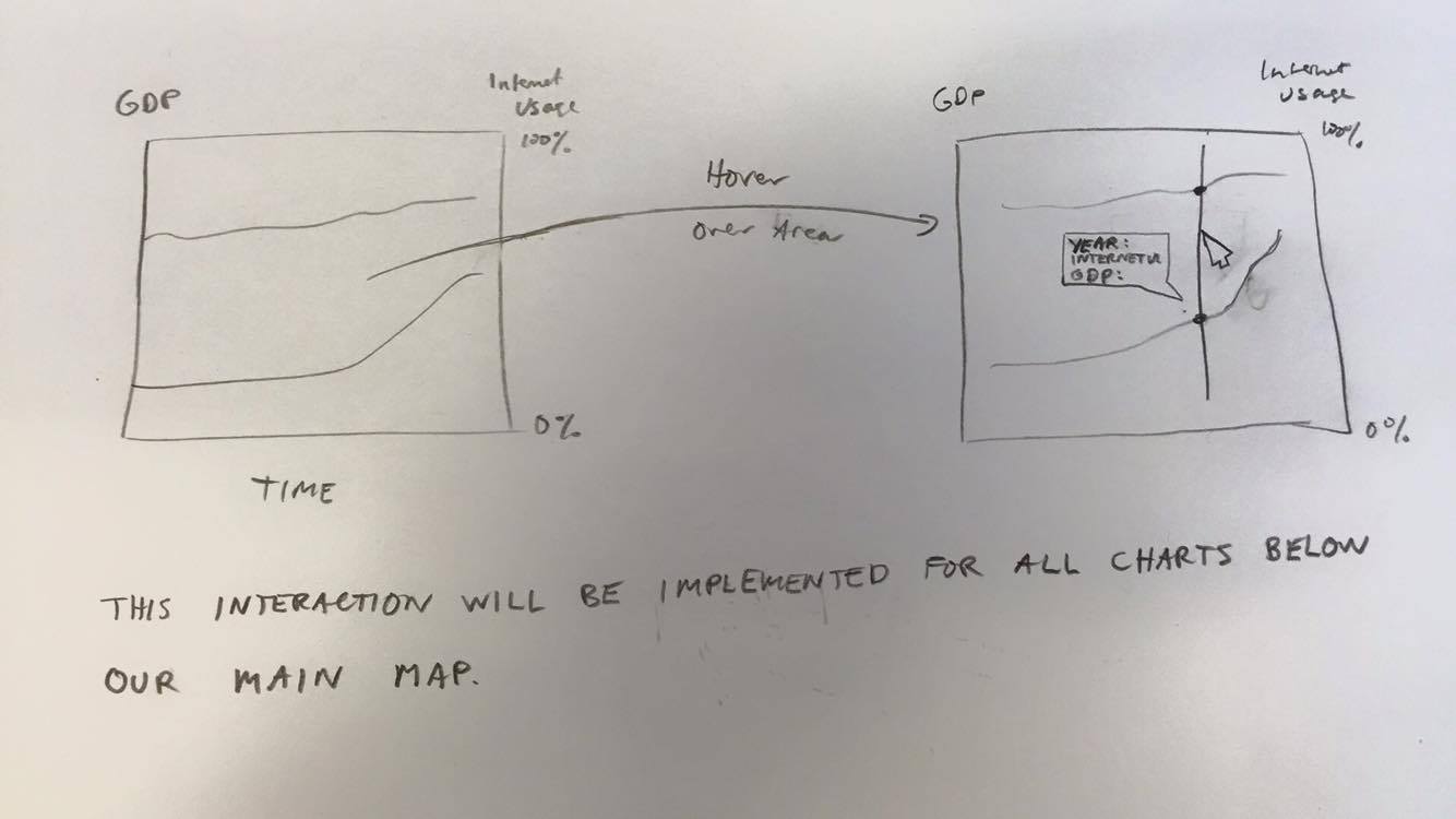
Design Evolution
"Figure 2: Visualization of Different Social Media Platforms"
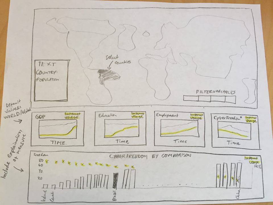
"Figure 3: Linked Visualizations for Landing Page"
"Figure 4: Line Chart Depicting Different Countries over Time"
"Figure 5: Animated Map to Represent Internet Use with Color"
An Expert Evaluation
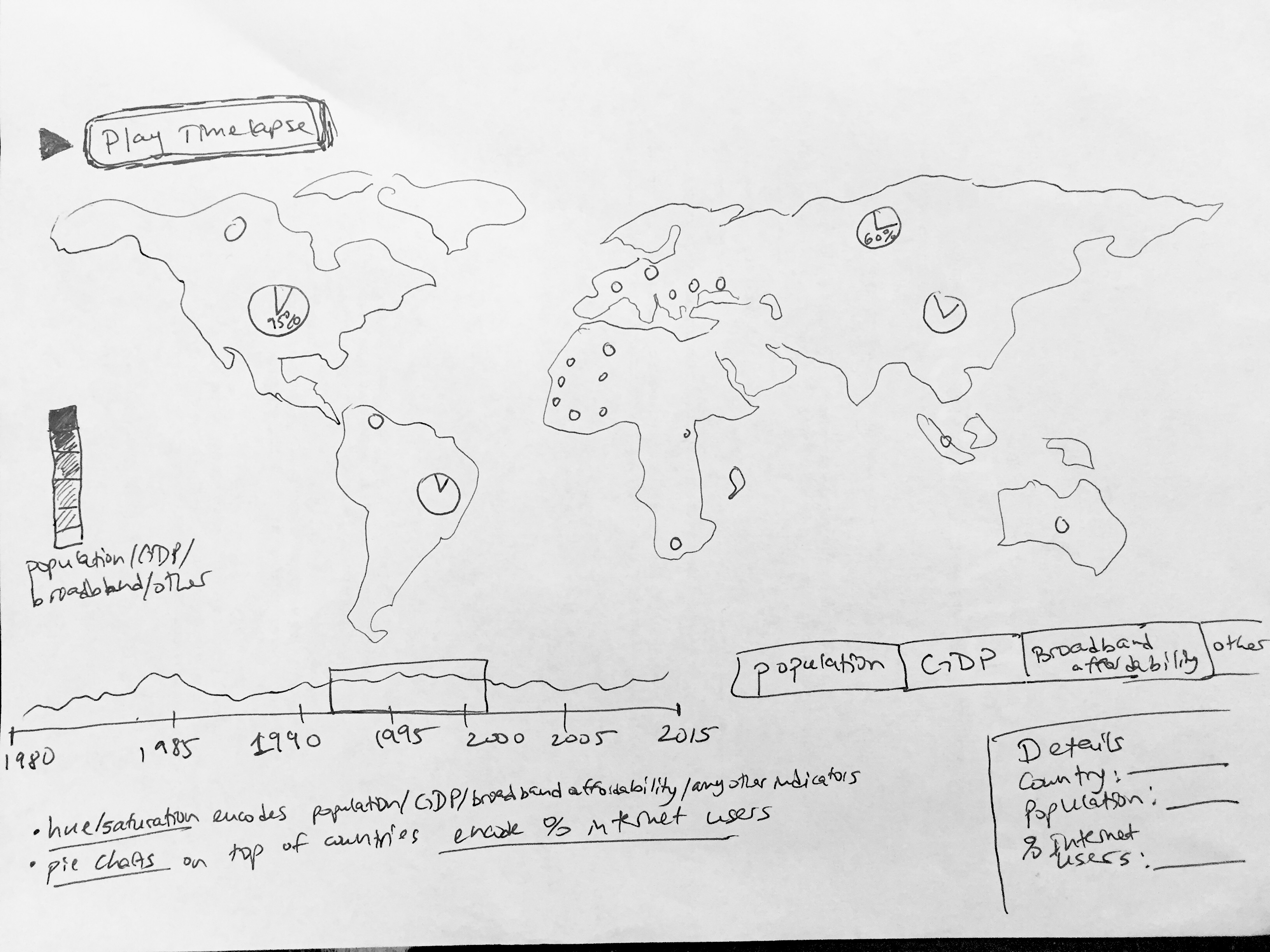
We had a user complete two tasks using prototypical sketches of our website, namely, the Dashboard and the bilevel encoding pie chart. The comments we received on the Dashboard were primarily that the user was presented with too much information too quickly. To rectify this, we may spread the information out a bit more via a scrolling layout, or we may introduce a page that prefaces the information so the user is not so overwhelmed. The other comment we received was that the bilevel encoding pie chart was not intuitive in knowing that it was able to be clicked. We want to rectify this by adding a hover feature, such that a highlighting of the given area encourages the user’s intuition to click and see more. This will be accompanied by a globe that zooms to highlight the selected country to give context. This follows a comment we received from our project advisor who suggested that it may be inefficient for comparing different countries. To combat this, we discarded the bilevel encoder idea and will instead be implementing a tree map that the user can modify by selecting which dimension of data to display. This will allow for more direct comparison between countries. These changes will, we believe, make the user experience easier to follow and will result in better comprehension of the data.
See below for a redesign of the bilevel encoding pie chart. Following peer feedback and feedback from our project advisor, we have decided that this is not the optimal way to represent this data. It is not inherently intuitive that the user can click on the pie chart, and it does not provide a clear comparison between countries. Instead, we will use a tree map that uses area to encode the various dimensions of our data, providing more data upon hovering. This will allow us to easily show out data honestly without the inherent lie factor that exists in using a map.
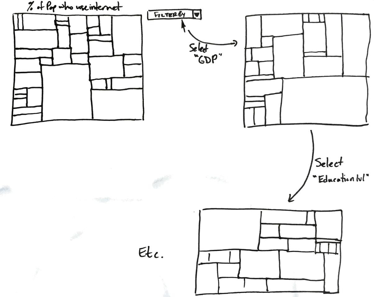
"Figure 6: A Treemap to Explore 5 Demographic Metrics over 25 Years."
Implementation
Front Page
frontpage.html: front-page.js, main.js
This is the welcome page to our site. It’s an invitation to explore and is designed to get the user interested in our project. Heavily inspired by the Facebook network visualization, we implemented a time-lapse animation of the world from 1991 to 2014. Each node that you see appear represents a city, and the cities blink to life as the amount of internet usage in that country increases. With this visualization, we hoped to eliminate the lie factor that geographic area creates in other cartographic visualizations. The area of the circle encodes population of that city, so we can not only represent which countries around the world are using the internet over time, but also how their internet use accelerates over time. For example, India has a massive increase in internet use in 2012, and you can see that there are portions of the world that remain “offline” throughout the entire period. We hope this page gets you excited to explore and learn more.
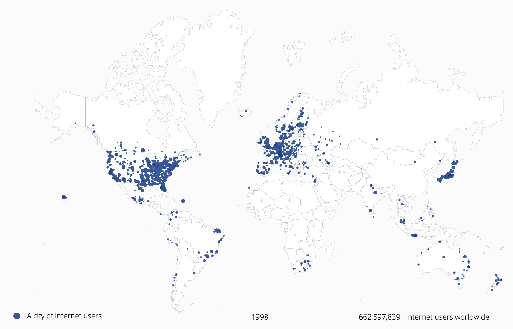
"Figure 7: Animation of the World Coming Online"
Dashboard
dashboard.html: dashboard.js
This is, arguably, our most complicated page. As with our front page, this choropleth map can be animated and controlled with the linked timeline object. Unlike the front page, however, this page has some inherent lie factor in terms of area. Because we are using saturation to encode level of internet usage, some larger countries may receive more visual attention than others. We believe, however, that this is a worthy sacrifice in order to enable a certain level of interactivity. Hovering over a country highlights it and shows the user specific values for that country in that year, giving ready access to details on demand. Not satisfied with a tooltip? Click on a country in demographic-map and see its data appear on demographic-line-chart. Better yet, why don’t you brush over that timeline and select a specific period of time you’d like to analyze. To explore how censorship correlates with internet usage, we invite you to click on the Censorship button in the upper right corner. Here, we’ve used a choropleth map to use hue to encode level of censorship in a country. This is accompanied by a bar chart on the bottom of the screen. The height and color of the bars encode level of censorship, and the vertical height of the dots encode level of internet use. With this visualization, therefore, we hope that you are able to make some inferences for the correlation between internet usage and censorship.
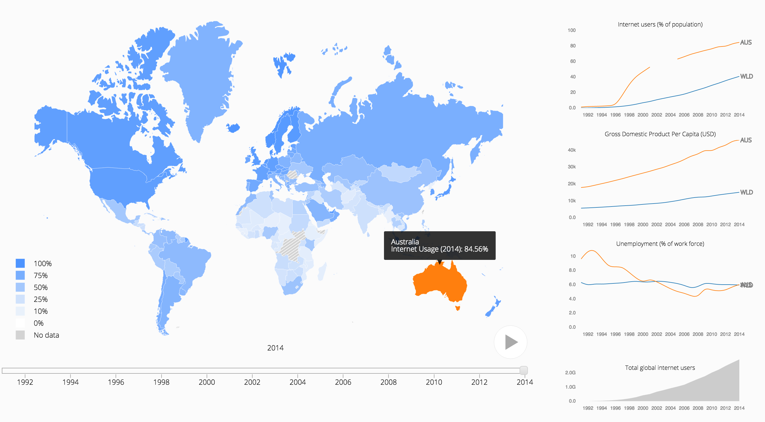
"Figure 8: A Choropleth Map Linked with Three Line Charts and a Brush Timeline"
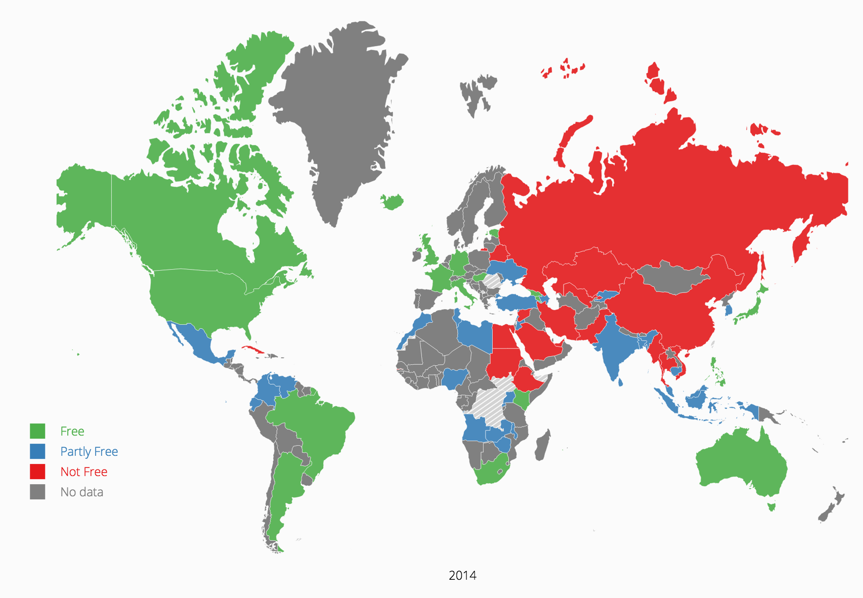
"Figure 9: A Choropleth Map Depicting Censorship"
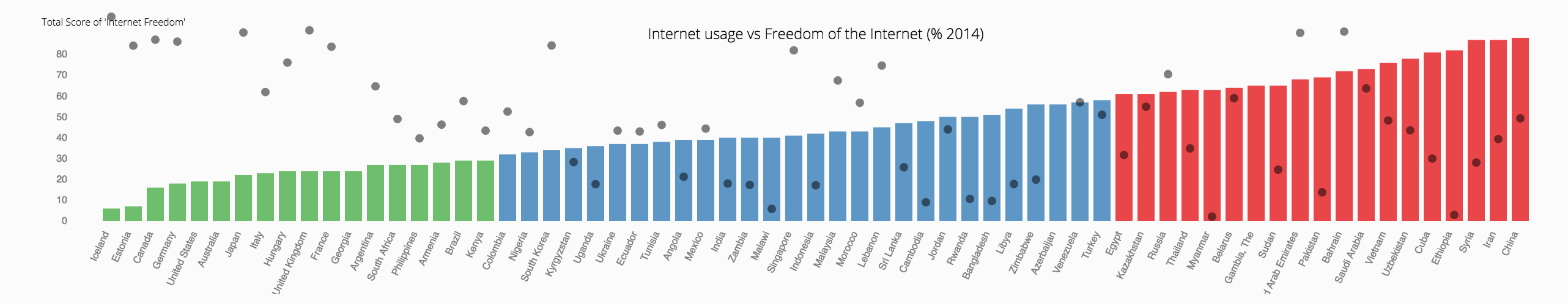
"Figure 10: A Visualization Showing Correlation between Internet Useand Censorship"
Demographics
countries.html: treeMap.js
With this treemap visualization, we used area to encode the demographic metric of your choice: GDP (in US Dollars), Access to Safe Water (% of the Population), Enrolled in or Completed Tertiary Education (% of the Population), and, of course, Internet Users (% of the Population). Not only can you select your metric of choice, but you can see how these metrics change over time. For example, scrolling through time to analyze GDP will reveal a rapidly increasing size of China’s rectangle. Simply hover over a rectangle to get specific values for that metric for that year.
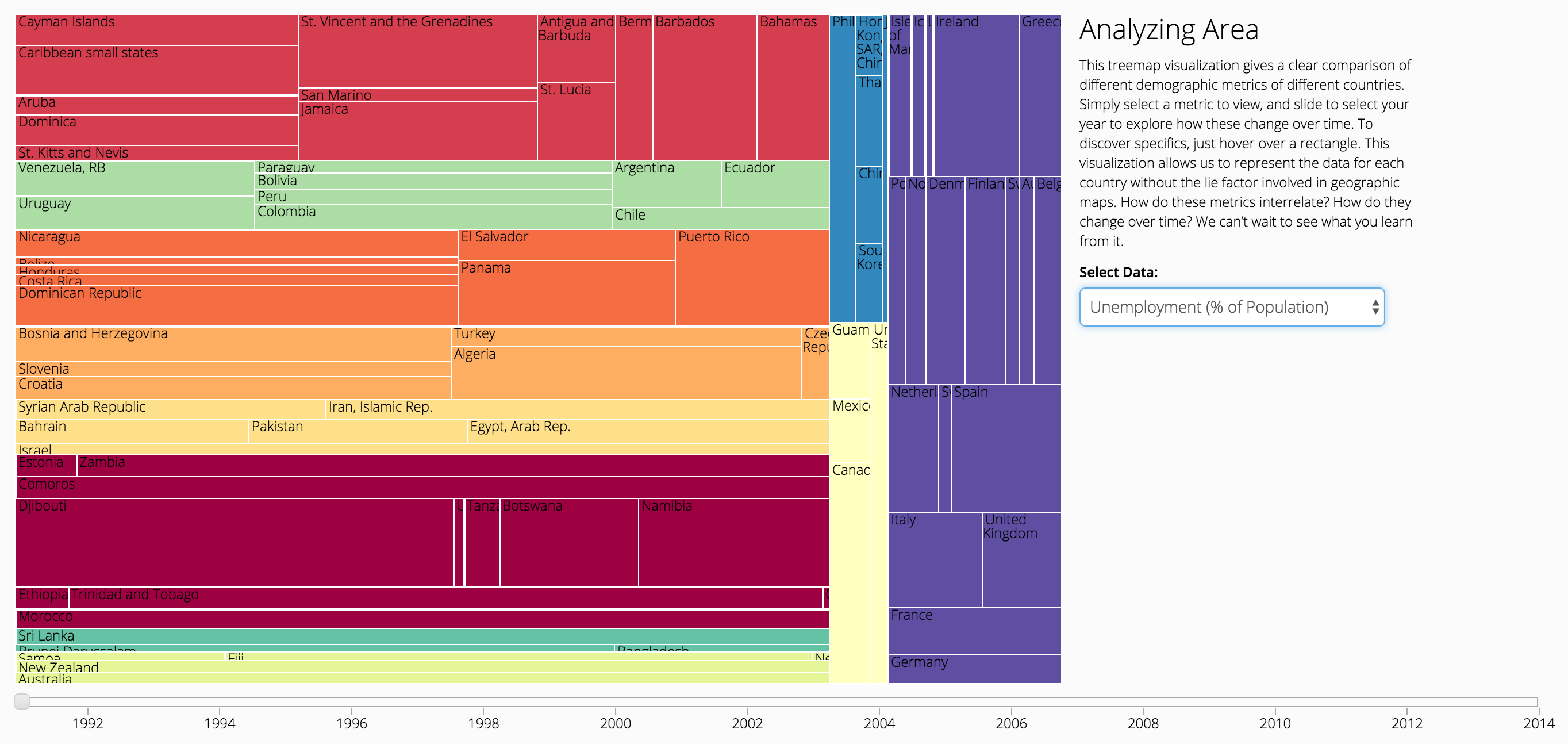
"Figure 11: A Treemap Depicting Demographic Metrics over Time"
Social Media
social-media.html: social-media.js
The timeline has circles which are centered at the year in which the social media platform or application was created. The area of the circle encodes the number of active users of that application. To learn more about that specific application, hover over a specific circle and see the information appear in the lower lefthand corner of your screen. To narrow the field of information, click the button at the top to see only Chat Applications or Social Network Applications. To get a snapshot of the social media use in a particular country, simply click on that country’s flag next to the bar chart. Here, the length of the bar encodes the percentage of the population that uses that particular platform.
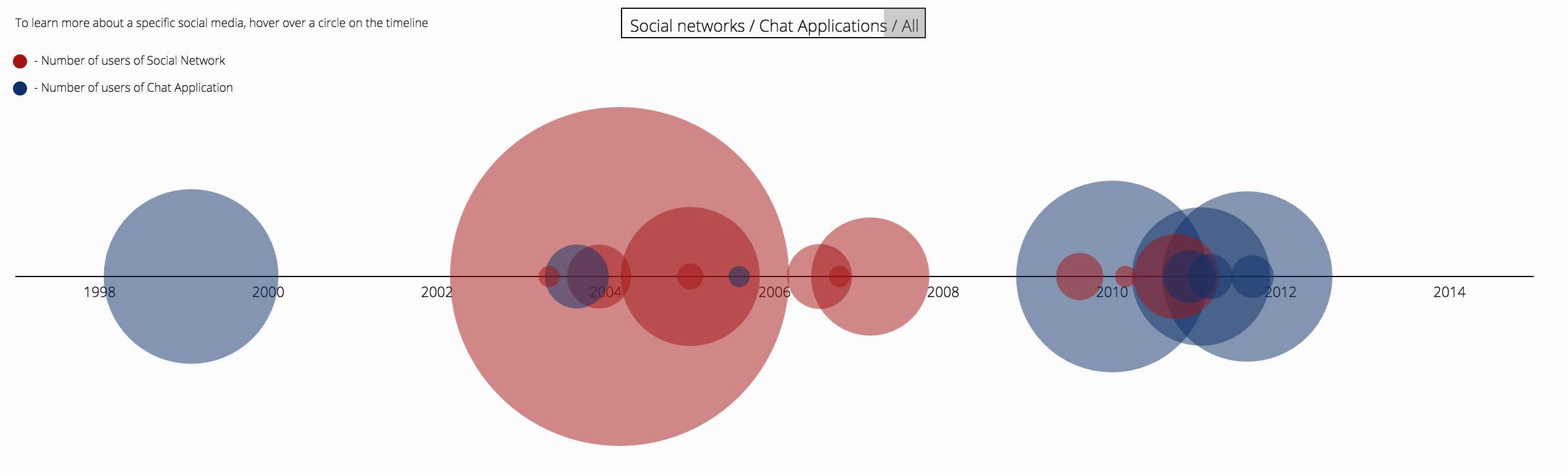
"Figure 12: A Timeline of Social Media"
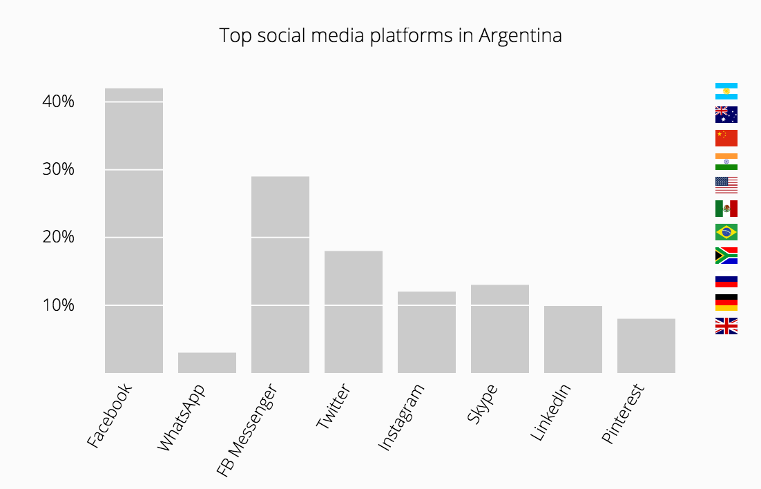
"Figure 13: A Bar Chart of Social Media Use by Country"
Evaluation
We began our project seeking to answer some questions about the internet. Who uses it and where? How has this use changed over time? And what about this social media thing? In exploring our visualization ourselves, and asking friends and colleagues for their opinions, we've made some discoveries as to the answers to these questions:
- Countries in North Africa and the Middle East, even presently, use less internet than the rest of the world.
- Increased censorship tends to correlate to decreased internet usage
- Countries in Southeast Asia have accelerated their "coming online" in the last five years compared to the rest of the world
- Markers of developed countries like access to safe water are not great indicators for internet usage
- Wealth and education indicators like GDP and tertiary school enrollment, however, tend to positively correlate with internet usage
- The types of social media used in different countries vary widely
These are just a few main findings from a small subset of people. We can't wait to see what you'll learn when you explore the Global Network.